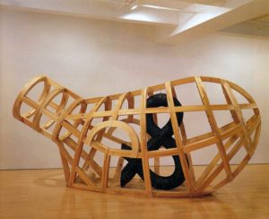
Puryear manages to make sculptures that seem abstracted and minimalist, but to which, thanks to an almost careless symbolism, he is able to give a meaningful content. With a narrative that moves one.
Rob Perrée on Martin Puryear
Vessel, 1997-2002.
The work of Martin Puryear
A STORY DRESSED IN ABSTRACTION
For years I have asked myself why I like sculptor Martin Puryear’s work. It is work that pays no serious attention whatsoever to any movement or significant reflection of the times. It rises above the delusions of the everyday, and yet nevertheless, or perhaps for that very reason, manages to touch me emotionally. In an interview with David Levi Strauss he says: “(…) it is obvious that my way of making art must seem anachronistic and out of sync with what is most vital in art today. I still work with my hands, in the belief that touch, or the way the material is manipulated, can influence the work, and that the physical making process itself can generate ideas, as well as bring them to fruition.”(Brooklyn Rail, November 2007) This indeed sounds traditional, but it is also appealingly contrary and, even more importantly, credible. It forms – quite unintentionally – an antithesis to the more commercially-oriented views of the Jeff Koons of the art world. My recent, renewed acquaintance with his work is not alone in convincing me of this. Puryear manages to make sculptures that seem abstracted and minimalist, but to which, thanks to an almost careless symbolism, he is able to give a meaningful content. With a narrative that moves one.
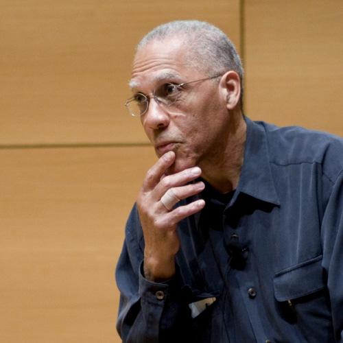
Between 1964 and 1966 Martin Puryear (1941) was a member of the Peace Corps in Sierra Leone, West Africa. He was teaching there, but could not help but be confronted with the history of slavery. While back at home race riots were breaking out, Malcolm X was murdered and the Black Arts Movement was founded, he was active in an area that provided the conclusive explanation for this turmoil. It would continue to influence his work. At the same time he got to know local craftsmen and their skills in converting natural materials into useable objects. He would go on to make full use of this craftsmanship in his works of art. In order to further sharpen his skills he also went to an art college in Stockholm for two years, where he studied printmaking. Finally he studied sculpture at Yale University and studied African art under Robert Farris Thompson who would find fame in 1984 with his book ‘Flash of the Spirit’.
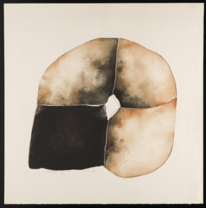
Quadroon, 1966-1967.
The etching ‘Quadroon’ (1966-67) that he made in Sweden would prove to be a key work. The reference is to someone of mixed race – in this case a quarter African – and to the evaluation of black Americans according to their degree of blackness. His theme is unveiled here for the first time and it is also a clear pointer for the abstract way that Puryear will go on to visualize this theme in later works. Within the context of Western art at that time the choice of abstraction was probably no great surprise, it was, however, surprising given the background of the objectives of the Black Arts Movement. This stimulated the “affirmation of the autonomy of black artists to create black art for black people as a means to awaken black consciousness and achieve liberation.” Abstract or minimalist art is not the most effective interpretation of this aim.
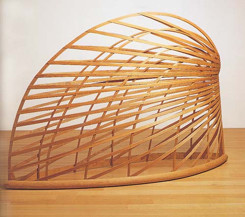
Bower, 1980.
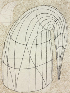
Untitled (State II), 2014.
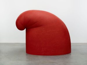
Big Phrygian, 2010-2014.
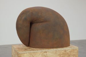
Up and Over, 2014.
‘Bower’ from 1980 exemplifies the way in which Puryear develops. This appears to be a minimalist work referring only to itself, but this is by no means the case. The shape is based on the Phrygian cap, a type of cap that symbolizes liberty and was worn not only by insurgents during the French Revolution, but also by their counterparts during the American Revolution. Puryear found one on an eighteenth-century postcard. In this case the cap was worn by a slave. The text on this card declared: ‘Moi Libre Aussi’. Puryear has used the Phrygian in many versions. As an etching for example (‘Untitled {State2}’, 2014), in red-painted wood (‘Big Phrygian, 2010-2014) and in cast iron (‘Up and Over’, 2014).
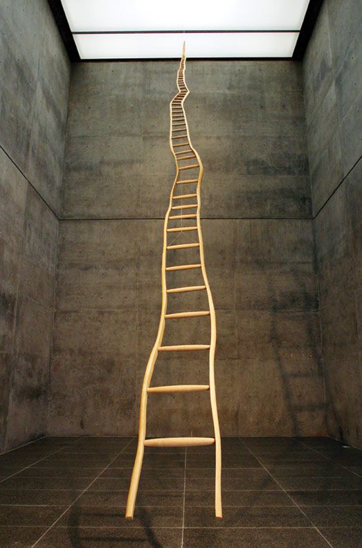
Ladder for Booker T. Washington, 1996.
‘Ladder for Booker T. Washington’ from 1996 appears to be a departure from his other works. The title is mostly to blame for this. It is representational since it seems to refer literally to a hero from black history who promoted self-improvement above politically influenced campaigns. Puryear denies this. “The title came after the work was finished, first of all. I didn’t set out to make a work about Booker T. Washington. The title was very much a second stage in the whole evolution of the work. The work was really about using the sapling, using the tree. And making a work that had a kind of artificial perspective, a forced perspective—an exaggerated perspective that made it appear to recede into space faster than, in fact, it does. That really was what the work was about for me, this kind of artificial perspective. It’s an idea I’ve been wanting to do for a long time. And it requires a certain actual length. It’s a piece that couldn’t have been done small. As it was, it was thirty-six feet long.” (Art21, November 2011) The story is plausible, but due to the title the work has nevertheless provoked many interpretations. For some it refers to Jacob’s Ladder, which according to the bible connects the earth to heaven. For others it is the elaboration of the uplift of the black men that Booker T. had in mind. Yet others see the fickleness of the ladder as symbolizing a difficult road to the top.
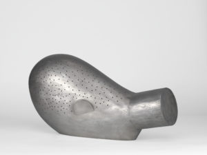
Face Down, 2008.
‘Face Down’ from 2008 is less explicit. The facedown figure refers to a Ngil mask as it was (and sometimes still is) used by the African Fang tribe. The white skin can be compared with the kaolin clay that is applied to the Fang masks. The figure is faceless as a mask-wearer is faceless. Could it be a black response to the recumbent head – ‘Sleeping Muse’ – by Brancusi? Certainly with regard to form, but with regard to reference they represent two different worlds.
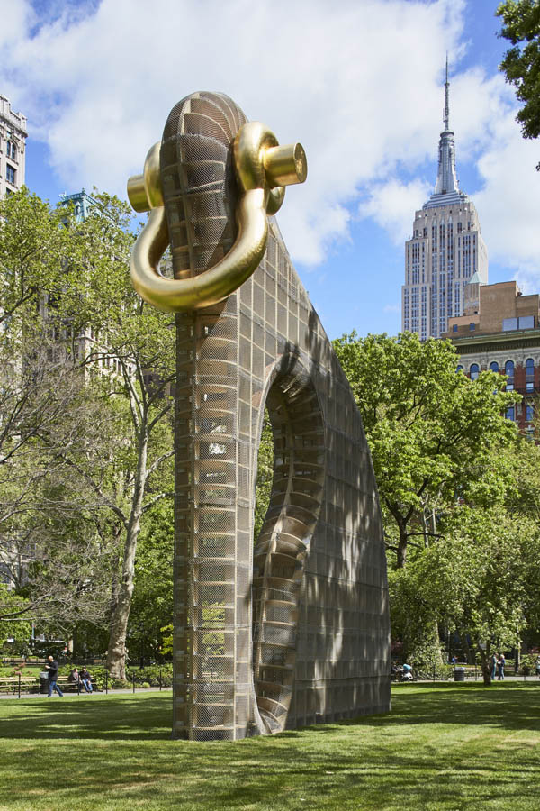
Big Bling, 2016.
Martin Puryear has been commissioned to produce sculptures at many locations in the world. One of the latest is ‘Big Bling’, a 40-feet high work in Madison Square Park in New York. From a distance it looks like a huge animal – I read somewhere: ‘a modern-day Trojan Horse’ – composed of a system of compartments that suggest accessibility (Puryear is opposed to all those sculptures with their robust unresponsiveness that places the viewer at a distance). The ring refers to the bling-bling of rap culture and also to the glittering jewelry that many blacks take great pride in wearing. Puryear also made a small version in black iron, ‘Shackled’ (2014). Because of the more modest size and the different material this evokes different associations with the chains with which slaves were shackled to the ship’s hold. Melvin Edwards (1937) often incorporated them into his assemblages and sculptures. Puryear is aware of this, of course. But since Edwards is much more political and direct in his work Puryear will not have intended this as an homage to his contemporary.
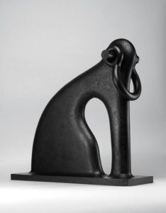
Shackled, 2014.
It is natural to compare Martin Puryear’s work with the sculptures by the British artist Richard Deacon. These are also abstract and open. The difference is that when these make a reference, it is to parts of the body. Puryear’s narrative encompasses far more drama and evokes a past that many viewers consider confrontational. Might this be the reason that in Europe Deacon’s work is much more popular than Puryear’s?
