I had recently visited a number of exhibitions which had given me fresh ideas about abstraction: Postwar: Art Between the Pacific and the Atlantic, 1945-1965 (Munich, 2016) and Soul of a Nation: Art in the Age of Black Power 1963-1983 (London, 2017), being two stand out examples. I was especially interested in a group of artists associated with ‘Black abstraction’ from the second half 20th century, most of whose work I was familiar with but had not always had the context for. Then I re-read James Baldwin’s short story ’Sonny’s Blues’. And now I stood before Rembrandt’s painting Oopjen Coppit. My intuition told me they were connected. I began to write, the outcome of which is an essay about Oopjen, Black Aesthetics, and abstraction.
Dineke Blom on Black and White abstraction.
Who’s Afraid of Black and White: two narratives
I was on my way to Cologne, or perhaps it was Düsseldorf (it was a long time ago). I had just turned eighteen. We took the bus, we being the students and staff of Ateliers 63 (now known as De Ateliers), to visit a Barnett Newman retrospective. When I was not looking out the window I was reading ‘Sonny’s Blues’, a short story by James Baldwin – “The Greatest Negro Writer” it said on the cover of my 1965 edition of Going to Meet the Man, the collection the story is part of. These are the opening lines of ‘Sonny’s Blues’:
“I read about it in the paper, in the subway on my way to work. I read it, and I couldn’t believe it, and I read it again. Then perhaps I just stared at it, at the newsprint spelling out his name, spelling out the story. I stared at it in the swinging lights of the subway car, and in the faces and bodies of the people, and in my own face, trapped in the darkness which roared outside.”
I felt the narrator’s anxiety, his sense of impending disaster, and instantly connected with him. The space beyond my narrow bus seat became a darkness which roared. Baldwin’s story had stirred something in me, I was immersed in Sonny’s world. When we arrived at the museum, the spell was broken. Barnett Newman’s work did not move me the way Baldwin’s story had. It was Modern Art and I felt detached. In the years to come, Newman’s work has grown on me, with Who’s Afraid of Red, Yellow and Blue one of my favorite paintings.
A recent plan to write about abstraction and 17th century Dutch painting brought back the memory of this excursion. I had recently visited a number of exhibitions which had given me fresh ideas about abstraction: Postwar: Art Between the Pacific and the Atlantic, 1945-1965 (Munich, 2016) and Soul of a Nation: Art in the Age of Black Power 1963-1983 (London, 2017), being two stand out examples. I was especially interested in a group of artists associated with ‘Black abstraction’ from the second half 20th century, most of whose work I was familiar with but had not always had the context for. These artists from the African diaspora were either born and raised in, or had emigrated to, the USA (particularly New York), or they originated from the former British colonies and had landed in London.
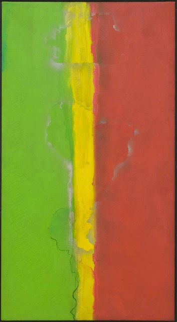
Frank Bowling, Who’s Afraid of Barney Newman,1968, acrylic on canvas 236,4 × 129,5 cm Tate Gallery, Londen
One of the abstract works that struck me was the painting Who’s Afraid of Barney Newman by Frank Bowling. Bowling, who was born in Guyana in 1934, painted it in 1968, one year after Barnett Newman had painted his Who’s Afraid of Red, Yellow and Blue. Having seen Bowling’s painting I could not but look at Newman’s with a fresh eye. The same held for other artists whose work I had been familiar with, such as Jack Whitten and Howardena Pindell, and which I now studied with renewed attention. This was also prompted by new information about the context of their work, including the artists’ personal backgrounds.
The background of these painters from the African diaspora resembles the world of ‘Sonny’s Blues’. To a certain extent I am familiar with this world, due to my own half Dutch half Surinamese background. It is obvious that such a personal history is not necessary for appreciating these works, or Baldwin’s story, though in my case it helped pieces of a puzzle fall into place, and see that this heterogeneous group of works I was thinking about formed in fact a whole of interrelated pieces: from Jack Whitten’s Birmingham, to Rembrandt’s Oopjen and other works from Dutch 17th century painting.
What connects them is that, for me, in these specific works the meaning of concepts such as trust, disruption, intimacy, hierarchy, or being of ‘two worlds’ (a first and a secondary) is investigated. The works are abstract or, in the case of the 17th century works, they demonstrate a degree of abstraction that catches my attention. I became curious about the ways in which these artists, who differ so much in background and era, are connected, and I delved deeper into my intuition. The motivation was less from an art theory or art history perspective and rather from myself being an artist: such research gives me insight into my own work process, it helps me move forward.
I, Black Abstraction
I begin with the artists from the former British colonies who had settled in London and New York. They share a mixed cultural background. Coming from the colonies they have two narratives, so to speak, a primary and a secondary one, which are related to each other. ‘Hierarchy’ is in my view a suitable term to define the inter-relation (and is related to the hierarchy between the so-called First and Third worlds). The relationship between the two cultural backgrounds is precarious, often problematic, and – speaking from my own experience – it may take years to approach the situation from a more playful angle and let the two stories interact and switch places in a dynamic way.
In the second half of the 20th century a debate took place about the position in the aristic mainstream that was allotted to these artists. The critic Wilson Harris wrote in reference to their mixed cultural backgrounds that: “the difficulty […] of accepting multiplicity as a difficult condition in which […] the cross-cultural tensions between one-and-many [are kept] unresolved and open-ended”. (Kobena Mercer, Black Atlantic Abstraction: Aubrey Williams and Frank Bowling in Kobena Mercer, ed: Discrepant Abstraction, pp.192, 197) What I appreciate about Wilson’s view of ‘the difficulty’ is that multiplicity is not to be leveled out but brought to light and left open-ended. Another topic in the debate was the idea that emigration, or frequent resettling, can instill a sense of “belonging nowhere”. Such a feeling might culminate in nostalgia, but it could equally shield the artist from nostalgia because ‘belonging nowhere’ opens up multiple artistic points of identification. In other words: it leaves their artistic orientation open-ended (here I’m paraphrasing Kobena Mercer).
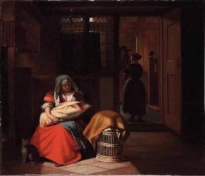

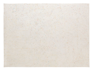
Pieter deHooch Woman with child on her lap, ca. 1675–1680 51.8 × 60.7 cm oil on canvas, private collection +detail
Keeping opposites open-ended is an attitude that I embrace whole-heartedly. I perceive it in 17th century paintings: specific paintings by Pieter de Hooch, Gabriël Metsu or Rembrandt are open-ended in the sense that, to me in any case, they evoke contrary emotions, of feeling at home and feeling alienated from home; of belonging and not belonging, of trust and disruption. They do not shy away from multiplicity, and this I find generous. In line with this characteristic is the co-existence of ‘two narratives’ (cf https://africanah.org/dineke-blom-surinamese-and-her-affection-for-dutch-paintings-from-the-17th-century/). Further on in this essay I will expand on this, taking Rembrandt’s painting Oopjen Coppit as an example.
In the USA a similar debate was being held in the second half of the 20th century, but here it focused on the question of Black Aesthetics. One question was whether any such aesthetics could be said to exist at all, and if so, what would it look like? I find it interesting that some even questionened whether a Black artist should make abstract work. Would they not be bowing to the ruling ‘white’ aesthetics? (cf https://africanah.org/quintus-jan-telting/). It might well be more effective (in the era of Civil Rights and Black Power) to express the Black experience by means of direct and literal imagery rather than through abstraction. The Black abstraction discussion has provided me with much information about the context of abstract art. I had never incorporated such context into my general knowledge of abstract art. It handed me a new lens through which I look at the works.
Here I proceed cautiously because ‘context’ is related to but does not fully align with ‘social narrative’, and this latter term was a precarious concept in the discussion around Black Aesthetics. Artists such as Jack Whitten and Frank Bowling, for example, were emphatically opposed to ‘social narrative’ as prescribed artistic form of expression. Here I quote the painter Jack Whitten (Bessemer, Alabama 1939 – 2018): “My early 1960s’s visits to Norman Lewis’ studio on 125th Street [were] a highlight of my life as a young artist. We spoke about painting, and we spoke about ‘The Problem.’ His insistence on the Black artists’ freedom to investigate pure abstraction without the intervention of social narrative continues to nourish my commitment to abstract painting.” (in Sarah Lewis, African American Abstraction, note 17, p.170; https://www.academia.edu/41503658/_African_American_Abstraction_) In an abstract work of art, experience, social narrative, be it Black or otherwise, is present implicitly rather than being spelled out in a direct and literal way. Put simply, the question was whether a socially engaged and/or activist artist should follow the path of “enunciation, stating what should be done” or or of “embodiment” (Sarah Lewis, https://www.academia.edu/41503658/_African_American_Abstraction_ p.163).
Knowledge of the context of the works of the artists associated with Black abstraction has widened my frame of reference and in this way it has helped me to feel the profoundness of their work. I will give a few examples. First is the aforementioned painting Who’s Afraid of Barney Newman (1968) by Frank Bowling. In Bowling’s work the red, yellow and blue of Newman’s painting are replaced by the green, yellow and red from Guyana’s national flag. In the centre of the image, hardly discernable, are the contours of Guyana and below these the contours of the South American continent. I quote from Tate Gallery (that has Bowling’s painting in its collection): “Bowling explored the cultural complexities of an African diasporic identity, playing with the aesthetic objectivity of abstract expressionism and interpretations of his own painting practice as ‘black’” (https://www.tate.org.uk/art/artworks/bowling-whos-afraid-of-barney-newman-t12244). Bowling’s reference to Newman’s painting is quite subtle – not knowing the title beforehand, I had not immediately noticed it.
Howardena Pindell Untitled, 1974–75, mixed media on canvas, 175 x 240 cm
The second example is Untitled, 1974-75 by Howardena Pindell (Philadelphia, Pennsylvania, USA 1943-). I came upon a remark that Pindell made in reference to this painting: “Circles are an iconic form: the sun, the moon, the Earth, the planets. After I started using them in my work, I remembered a time drinking root beer with my dad as a child. It was during segregation, when it was court-mandated that utensils had to be designated whether someone of colour could use them; they painted huge red dots under the mugs.” (https://www.theguardian.com/artanddesign/2021/nov/27/howardena-pindell-i-could-have-died-thats-when-i-decided-to-express-my-opinion-in-my-work). Her observation is factual and revealing. It gives context that by myself I would never associate with an image made up of countless circles. Knowledge of this context makes the work no less abstract, the difference is that the information deepens my connection with the painting. This is not about ‘hineininterpretieren’ but it is a matter of approaching the work from a broader frame of reference. For Pindell, the memory resurfaced when she was well under way in her use of the circle motif: “After I started using them.” It is a detail that I find relevant in connection with ‘embodiment’. Pindell’s experience, which is meaningful for her as an Afro American artist (and activist), is implicitly present in the work.
(In anticipation of my following remarks on Rembrandt’s Oopjen, for me the painting’s content resides less in the narrative, i.e. a portrait of a 17th century lady, with all descriptions that come with it, and more so in the way in which abstract and near-abstract elements interact. In this way Oopjen’s content (as defined by me) is implicit in the work, it is embodied.)
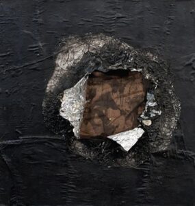
Jack Whitten Birmingham 1964, aluminum foil, newspaper, nylon, and oil on multiplex, 42 x 40 cm. Brooklyn Museum, USA photo: John Berens
The final example is in Birmgham, a painting by Jack Whitten (Bessemer, Alabama USA 1939-2018). Throughout the years I have followed and admired Whitten’s work, but I had never fully appreciated this specific painting until recently. Naomi Beckwith’s extensive description of this work (in The Week in Art podcast, February 2021) was illuminating. Birmingham is an abstract monochrome work; and then again it is not: the surface is torn as if an object has been pushed through it. This creates a rough-edged circle. The edges reveal that the monochrome black paint was in fact applied on aluminum foil. Inside the circle yet another layer appears, onto which a news story image is pasted. It is a picture, barely discernable, of the 1963 race riots in Birmingham, Alabama (Bessemer is a suburb of Birmingham, AL). The photograph shows police violence exerted on unarmed citizens demonstrating for their Civil Rights. The painting as a whole is powerful – not only because of the news image and what it represents but, in my view, especially because of the violent gesture that caused the surface to be ripped open. Here, context literally bursts through the surface and becomes visible.
Yet, it would be a reduction to ascribe the painting’s impact exclusively to the news image of brutal police violence. Whatever gives the image its emotional charge is implicit. This implicit character gives me space, when I contemplate the work, to also draw from my own experience, my own social narrative, all the while realising that my experience differs from Whitten’s.
In an artist statement Whitten has shared his thoughts about abstraction, and I was moved by the way in which he links abstraction to inner life: “Perception is a lens: it enables the artist to dissect the world. […] Abstraction is a particular tool of perception, akin to a microscope. […] Perception functioning at the molecular dimensions of inner space is what I have identified as “molecular perception.” (High Times Hard Times: New York Painting 1967-1975, Artist Statement, p.101). Abstraction offers a glimpse on the “molecular dimensions of inner space”. What strikes me is Whitten’s inclusive choice of words: the artist; inner space, not my inner space.

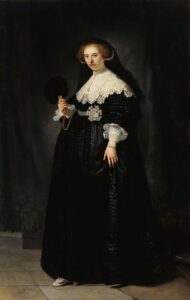
Rembrandt van Rijn, Oopjen Coppit, 1634 oil on canvas 207,5 x 132 cm. coll. Rijksmuseum, Amsterdam and Louvre, Parijs
II, Rembrandt’s Oopjen through the lens of abstraction
I have made a few preliminary remarks about Rembrandt’s painting and its aspects which in my view connect it with Black abstraction: open-ended multiplicity; implicit content, and, of course, the painting’s abstract elements. Before expanding on this I want to point out that I develop my thoughts about specific 17th century paintings simply by looking at them. My encounter with Oopjen went no different. Here I trace the steps of this process of observing and reflecting.
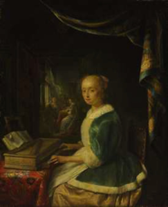
Recently, I saw Oopjen again (the painting is named after the person it depicts), I approached the painting from the farthest corner of the Rijksmuseum’s Gallery of Honour. On this visit, my first impression was of a huge, almost monochrome black surface interspersed with a few dazzling bright shapes. Closer by, the figuration became more obvious. In the black surface I now distinguished a dress, a feathered fan, veil, stair steps, drapery, and part of a shaded stone wall. The bright shapes belong to Oopjen’s face, and her hands, cuffs, rosette, collar. They are grouped together in the upper half of the image. In the painting’s bottom part one shoe, lit up, is visible.
Oopjen is one half of a dyptich, the other half is Maarten, the portrait of Oopjen’s husband. When you see Oopjen you see Maarten. But Oopjen fascinates me more. Rembrandt captures her just when she is descending the stairs, the tip of her right shoe is barely touching the floor, her left foot disappears under her skirt or seems to hover for a brief moment above the floor. With her left hand she tilts her skirt just a little. Her glance is self-assured and at ease: friendly eyes, lips pressed but with a hint of a smile, her head tilted ever so slightly. This is no stiff pose but a brief moment, unassuming (in contrast to Maarten, who poses). If, for the sake of argument, I ignore the subtle indications of movement in Oopjen’s feet and head, then Oopjen’s overall image shows a solid vertical shape that stretches from the lower part of the collar down to the fringes of the skirt. The pleats form a pattern of vertical upright stripes of darker and lighter shades of black and gray, which run parallel with the painting’s sides and are at right angles to the bottom. I estimate the overall proportion of dark to light at 10:2.
The proportion of background to foreground I also estimate to be 10:2. As a result of this latter estimate, Oopjen partly dissolves into the dark colour field surrounding her, she is merging with the background. It took me no effort to step back from a figurative reading and surrender to the abstract colour field, the shades of black (in which I discern more colours). I see a vibrant pattern of shapes, super-imposed, overlapping, alternatingly coming to the front and receding deeper into the background. As I take in this abstract scene, I notice that my scanning of the image has slowed down: the time it takes for me to go over the image from left to right and from top to bottom is far longer than the glance that suffices for me to know that I am dealing with a portrait.
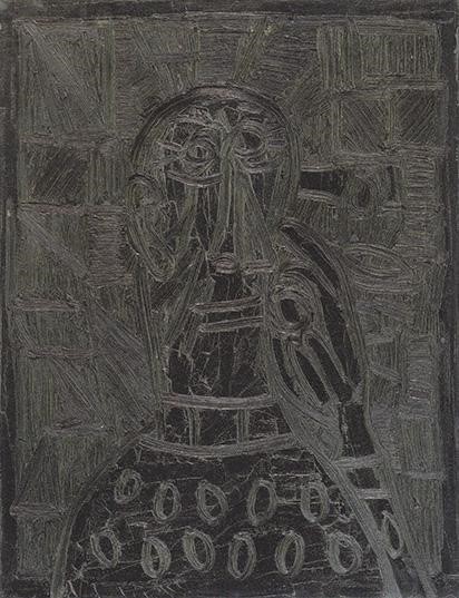
Francis Newton Souza, Head of a Man Thinking, 1965, oil on canvas 66×50,8 cm. coll. Amritha Jhaveri
Oopjen’s skirt is enormous because it falls around her pregnant body. In my concentrated act of looking I tend to forget this logical explanation because I am overwhelmed by the painting’s pictorial qualities. The blackness of the skirt is dense and opaque and I scan it less smoothly than the black parts around it. What strikes me as well is the straight and upright position of a group of lighter colour bands – the pleats – in the composition. They give the painting geometrical precision, and do so in the absence of sharp contours, or more accurately, in the deliberate absence of sharp contours. An observation comes to my mind, made by the curator and former director of Haus der Kunst, München, Okwui Enwezor (1963-2019). Referring to the painting Head of a Man Thinking (1965) by Francis Newton Souza (Goa 1924 – 2002) (image Souza), Enwezor noted “blackness’s need for intense acts of looking.” (Postwar: Art Between the Pacific and the Atlantic 1945 -1965, p.32). I had not been aware how well his description fitted my own act of looking at Oopjen: a formal glance had shifted into an emotional glance. What prompted the shift is the interaction between figuration and abstraction.
When it comes to the relation between figuration and abstraction, two objects on Oopjen mystify me: the black-feathered fan and the black veil. The veil in particular baffles me, it falls shapeless around Oopjen’s head – Rembrandt has painted it without any bravura. As to the fan, I had a hard time recognizing it here. The status of both shapes is ambivalent. They are part of Oopjen and they are part of the background. What is more, it is via these very shapes that I switch focus from the foreground to the background. The veil mystified me, I was not sure how to ‘read’ this shape which simultaneously curves and sits rigid around Oopjen’s head. But then I realized that this confusion may well have been intentional. Of course I ultimately knew what to make of the two shapes, but what intrigues me is that these two are the instruments that pull me deep into the image, and ever deeper into the background.
The fan and veil are tipping points between ‘front’ and ‘back’. Receding backward, they merge with the abstraction of the dark colourfield; tilting forward, they become part of the painting’s figuration. My eyes follow how they switch back and forth. Looking at Oopjen in this way, I become immersed in the painting. It is an intense act of looking, the outcome of which is that I have a better sense of what the painting means to me.
I must admit that my description of Oopjen does little justice to how lifelike Rembrandt has rendered her. But in the context of this article I am less concerned with the portrait of a lady than with the ‘portrait’ of Oopjen the painting. As a portrait of a painting, Oopjen evokes, at least to me, unlimited space to think freely, to muse about concepts and about experience. For this reason I would call Oopjen a pensive image. I borrow this term from Hanneke Grootenboer, who in her book The Pensive Image: Art as a Form of Thinking, a study of (mainly) 17th century Dutch painting, describes a pensive image as an image which “neither tells a story nor conveys a specific meaning but rather articulates, through its form and materiality, a line of thinking.” (The Pensive Image: Art as a Form of Thinking (The University of Chicago Press, Chicago and London 2020, p.23). Oopjen is the portrait of a lady of specific descent and social status, and it invites further iconographic interpretation. However, on another level its content is left open, it is open-ended.
As such it is an invitation to contemplate on concepts and on (my own) experience. I myself noticed that it made me think about hierarchy. Precisely in the black shapeless veil and the contourless feather fan, in the spot where foreground and background merge, the hierarchical order between what comes first and what comes second is upturned. The two levels, ‘front’ and ‘back’, or, formulated differently, ‘first narrative’ and ‘secondary narrative’, switch places, back and forth, putting a rhythm to my act of looking. Fan and veil belong to the one (as objects connected to Oopjen) and they belong to the other (merging with the background). What impresses me most is that two unassuming shapes play a crucial role. They, of all shapes and objects, are the turning points in the painting, they determine how the painting ‘works’. Rembrandt could have opted for a ray of light that points straight at these two shapes. But there is no well-aimed ray of light, and I am happy for it. A straightforward hint would have exposed with a blunt gesture what is subtly embedded in the background. And the crucial thing was precisely that the background-foreground switching is activated only in an intense act of looking. Only the viewer can make this happen.
‘Hierarchy’ as expressed in Oopjen does not negate that there is a difference in status between the two levels, but which status is attributed to which level is left open. In my continuous back-and-forth switching, one moment the background is ‘first narrative’ and the next moment it is the foreground. Around me in the Gallery of Honour I hear ahh’s and ohh’s of viewers pointing to Oopjen’s collar and to the rosettes on Maarten’s shoes. I join in because I gladly surrender to those lush, sensuous rosettes, or to the dazzling white of the collar.
But I wish to pay homage to the richess and virtuosity of the ‘secondary narrative’. To give center stage to those areas of the image that are easily overlooked because our eyes are transfixed by what is lit up so bright in the foreground. Besides Oopjen, other paintings by Rembrandt and by his contemporaries contain background scenes where figuration all but disappears in a dark colourfield. Interiors by Gerrit Dou, Pieter de Hooch, Adriaen van Ostade, Nicolaas Maes, Gabriël Metsu provide examples of this. In these background scenes I do not find virtuosity of the ‘ohh’ and ‘ahh’ kind. By contrast, virtuosity of the background kind is fuelled by an ambition to ‘shine’ in unobtrusive but nonetheless rich gradations of black, gray, darkness, obscurity. The darkness is, moreover, suggestive and enigmatic because it leads the eye to a space that recedes even further into the background.
Emanuel de Witte, Interior with a woman at a virginal, 1665-70 77,5×104,5 cm oil on canvas, Museum Boijmans van Beuningen, Rotterdam
Gerard Dou, A Lady Playing a Virginal 1665 39×32 cm oil on panel, Johnny van Haeften Gallery, London + detail
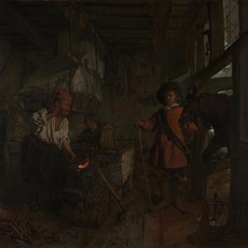
Gabriël Metsu A Cavalier Visiting a Blacksmith’s Shop c.1654-56 65,4×73,3 cm oil on canvas, The National Gallery, London
For me, such inconspicuous scenes make a particular painting of over four hundred years old exciting to look at. I would say that their inherent ‘difficulty’ lies here, a difficulty in the sense that the secondary narrative, the ‘background’ one, is not revealed rightaway. It comes forward, literally, only when one looks atttentively, intensely – through Jack Whitten’s imaginary lens, I would say.
I could have excluded from my notes on Oopjen, the input of 20th century artists such as Whitten and their notions about abstaction. But such omission would have left me with loose pieces of a puzzle. In themselves the separate pieces are meaningful. But I sensed that Jack Whitten c.s., ‘my’ 17th century painters and, equally, novels and short stories such as Sonny’s Blues, are related to each other, even if I could not put the finger on it rightaway. What connects them and levels out the distance in time and cultural backgrounds is, ultimately, ‘experience’, the way in which one stands in the world.
Rembrandt’s Oopjen, and Frank Bowling’s or Howardena Pindell’s paintings leave such experience open-ended.
© Dineke Blom June 2023